Add X & Y Axis Labels to ggplot2 Plot in R (Example)
This article illustrates how to create user-defined axis labels in a ggplot2 plot in the R programming language.
Table of contents:
- Creating Example Data
- Example: Adding Axis Labels to ggplot2 Plot in R
- Video, Further Resources & Summary
Let’s dive right into the R code:
Creating Example Data
In this example, we’ll use the following data frame as basement:
data <- data.frame(x = 1:10,          # Create example data
                   y = 1:10)
Our data consists of two numeric columns x and y.
Furthermore, we have to install and load the ggplot2 package of the tidyverse.
install.packages("ggplot2")           # Install and load ggplot2
library("ggplot2")
Now, we can draw a ggplot2 scatterplot with default specifications as follows:
ggp <- ggplot(data, aes(x, y)) +      # Create basic ggplot
  geom_point()
ggp                                   # Draw ggplot

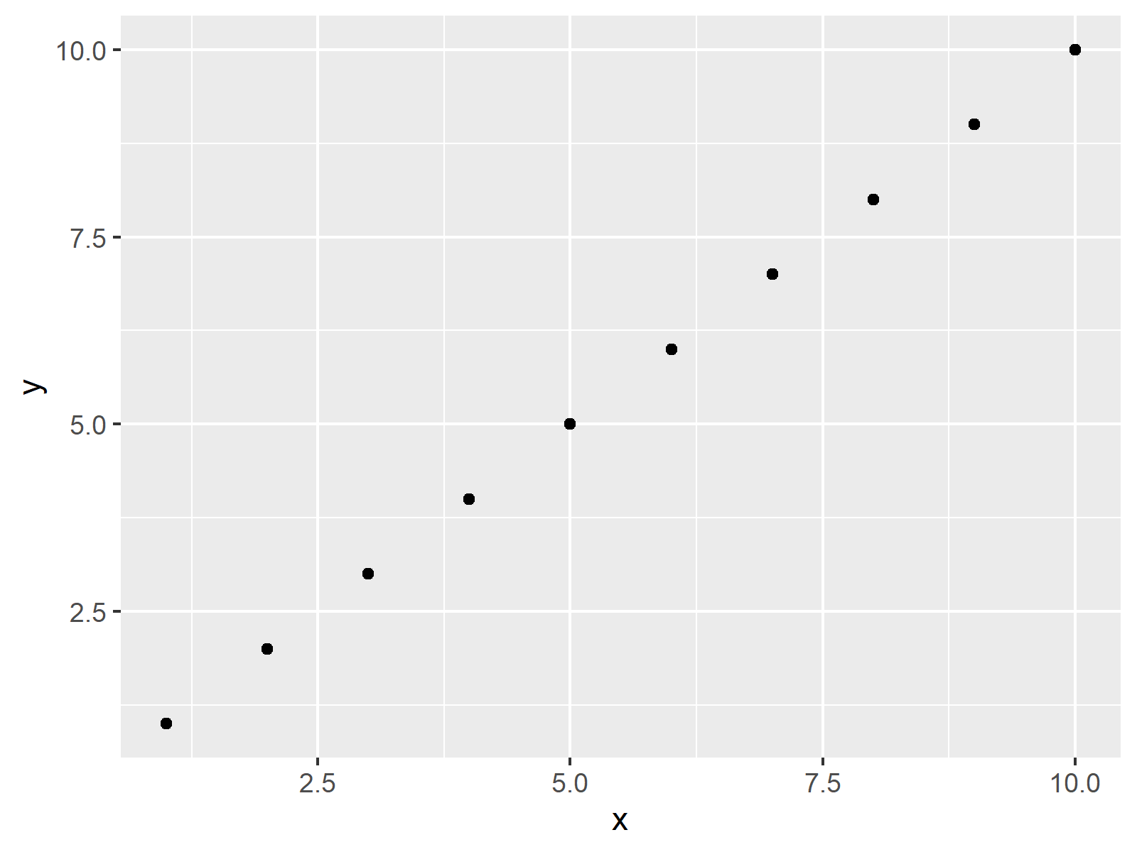
Figure 1: Basic ggplot2 Plot in R.
Figure 1 shows the output of the previous R code – a basic scatterplot created by the ggplot2 package. As you can see, the title labels are named x and y.
In the following, I’ll show you how to change these label names in R…
Example: Adding Axis Labels to ggplot2 Plot in R
If we want to modify the labels of the X and Y axes of our ggplot2 graphic, we can use the xlab and ylab functions. We simply have to specify within these two functions the two axis title labels we want to use:
ggp +                                 # Modify axis labels
  xlab("User-Defined X-Label") +
  ylab("User-Defined Y-Label")

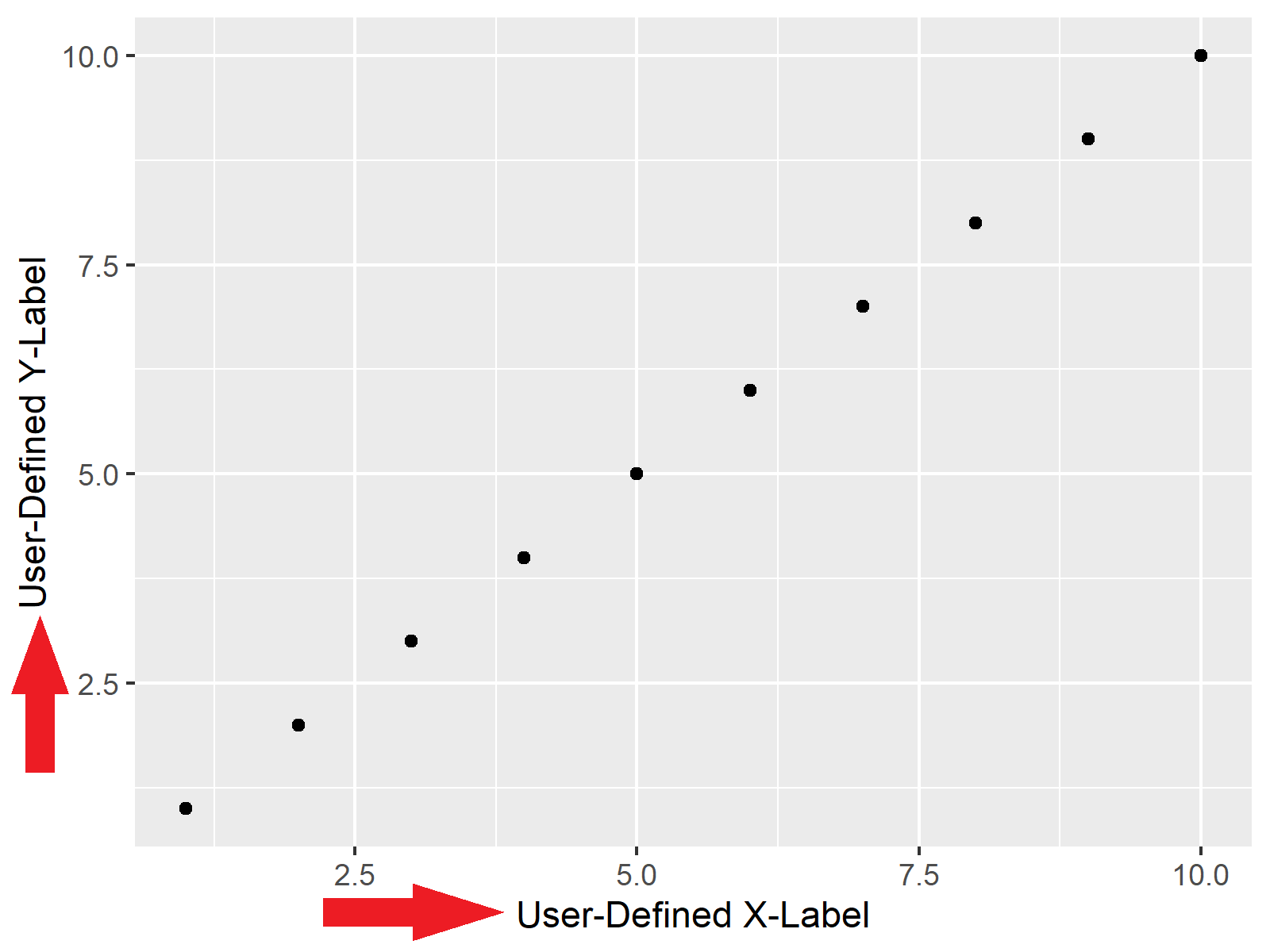
Figure 2: ggplot2 Plot with User-Defined Axis Labels.
Figure 2 illustrates the resulting plot. As you can see, the axis labels were renamed.
Please note that this example relied on a scatterplot. However, the previous example code could also be applied to other types of plots such as barcharts, boxplots, heatmaps, pie charts, and so on…
Video, Further Resources & Summary
Some time ago, I have released a video on my YouTube channel, which illustrates how to change the names of x- and y-axes based on the examples of this post. Please find the video instruction below.
Furthermore, you may read the other articles of my homepage. Some articles about the plotting of data in R are listed here:
Summary: In this tutorial you learned how to rename axis label names to a ggplot image in R. If you have any further questions, kindly let me know in the comments section. Furthermore, please subscribe to my email newsletter to get updates on the newest tutorials.


