Add Regression Line to ggplot2 Plot in R (Example) | Draw Linear Slope to Scatterplot
In this R tutorial you’ll learn how to add regression lines on scatterplots.
The article contains one examples for the addition of a regression slope. More precisely, the content of the tutorial looks as follows:
- Creation of Example Data
- Example 1: Adding Linear Regression Line to Scatterplot
- Video, Further Resources & Summary
With that, let’s start right away.
Creation of Example Data
In the following R programming tutorial, we’ll use the data frame below as basement:
set.seed(8743)                             # Create example data
x <- rnorm(1000)
y <- rnorm(1000) + 0.3 * x
data <- data.frame(x, y)
head(data)                                 # Print first rows of data
#            x          y
# 1  1.2138865 -0.3500503
# 2 -1.8828867 -1.1576045
# 3 -0.2739309 -0.9035707
# 4  1.0028479 -0.1521459
# 5  0.6276009 -0.4914815
# 6 -0.9443908 -1.3845497
As you can see based on the output of the RStudio console, our example data contains two numeric columns x and y.
Furthermore, we have to install and load the ggplot2 package to R:
install.packages("ggplot2")                # Install & load ggplot2
library("ggplot2")
Now, we can draw a basic scatterplot with the ggplot2 package with the ggplot & geom_point functions as follows:
ggp <- ggplot(data, aes(x, y)) +           # Create basic ggplot
  geom_point()
ggp                                        # Print ggplot

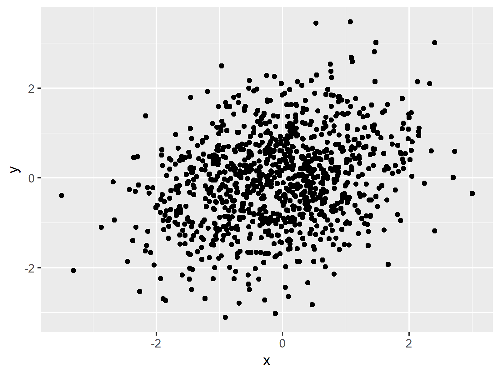
Figure 1: Basic ggplot2 Scatterplot without Regression Line.
Figure 1 shows the graphic that we have just created. It’s a simple dotplot showing the correlation of our variables x and y.
Example 1: Adding Linear Regression Line to Scatterplot
As you have seen in Figure 1, our data is correlated. We may want to draw a regression slope on top of our graph to illustrate this correlation.
With the ggplot2 package, we can add a linear regression line with the geom_smooth function. Have a look at the following R code:
ggp +                                      # Add regression line
  geom_smooth(method = "lm",
              formula = y ~ x)

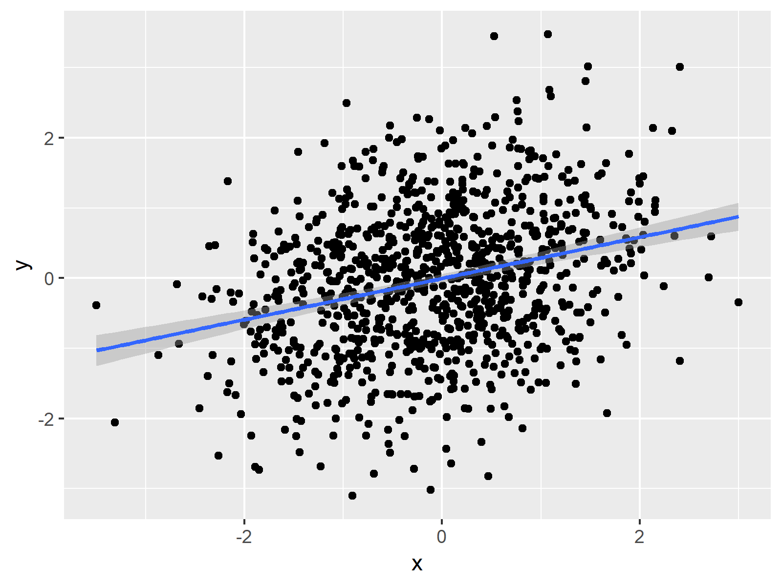
Figure 2: ggplot2 Scatterplot with Linear Regression Line and Variance.
Figure 2 shows our updated plot. As you can see, it consists of the same data points as Figure 1 and in addition it shows the linear regression slope corresponding to our data values. The shaded area around the trend line illustrates the variance.
Video, Further Resources & Summary
Do you want to know more about regression slopes and graphics in R? Then you may watch the following video which I have published on my YouTube channel. In the video, I’m explaining the R programming codes of this tutorial.
Besides the video, you may want to read the other tutorials of my website. You can find some tutorials here.
- Scatterplot in R
- Draw Vertical Line to X-Axis in ggplot2 Plot
- R Graphics Gallery
- The R Programming Language
In summary: In this post, I showed how to insert a linear regression equation line to a ggplot2 graph in R. In case you have any additional questions, let me know in the comments section.


2 Comments. Leave new
How can I add co-factors to a linear model “lm” when I insert a linear regression equation line to a ggplot2 graph ?
Hi Thomas,
Please have a look at this tutorial for more explanations on this.
Regards,
Joachim